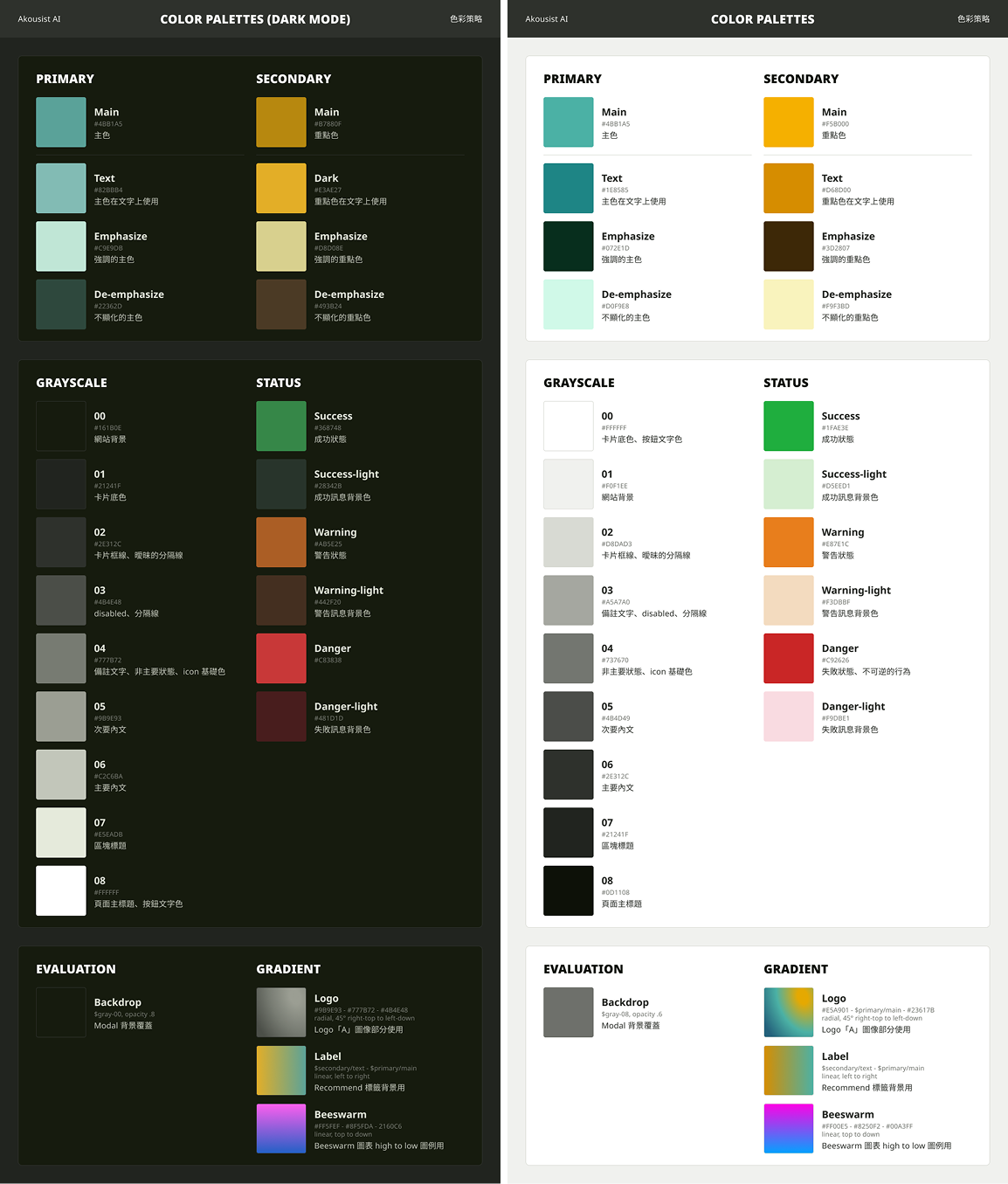
這是我為生技 AI 平台建立專屬的 Design System,其色彩策略靈感來自醫師穿著的刷手服,融合「生生不息」與「永續」的理念。主色選用彩度較低的綠色,並以此色系延伸出一套具備完整層次的灰階色組,可靈活應用於文字、區塊與背景等元件。強調色採用橙黃色,營造出強烈對比與朝陽般的活力感,用於重要的按鈕與標籤設計。品牌的 CI 則使用黃綠色漸層,傳遞健康、生命力與積極的品牌印象。
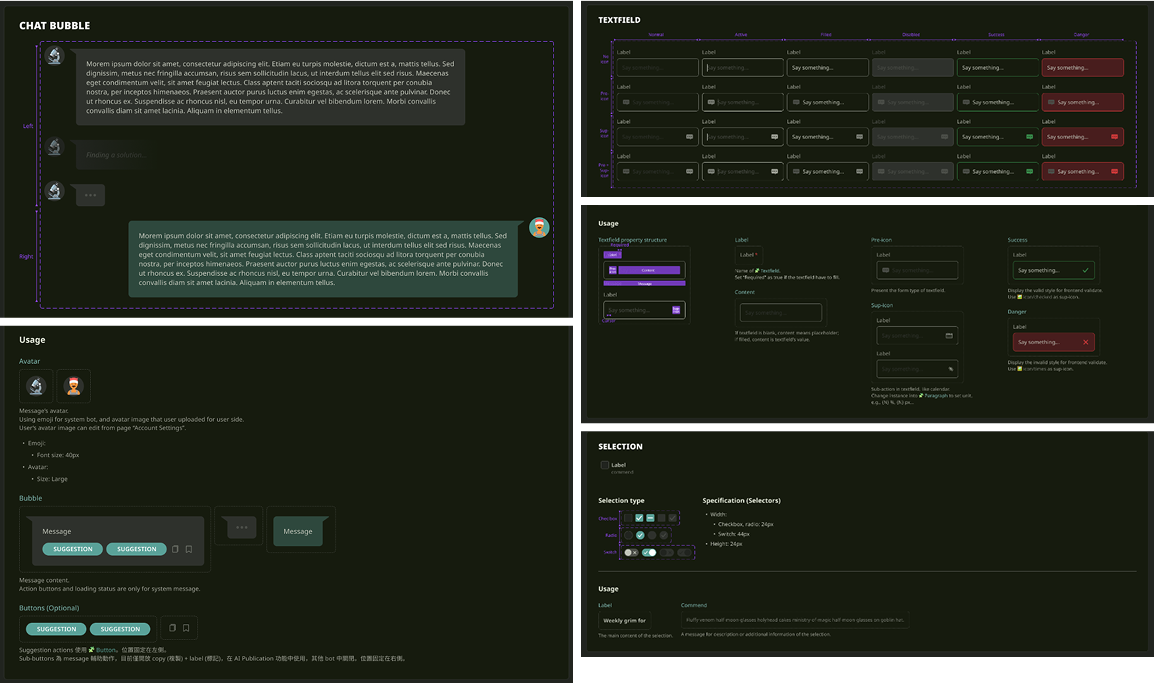
在元件設計上,採用較寬鬆的邊距與圓角設計,按鈕則為單邊全圓的膠囊形,整體風格清新舒適。字體尺寸以 16px 為主要內文基準,並根據需求向上下延伸,確保閱讀體驗佳。字體選用支援多語系的 Noto Sans/思源系列,利於平台未來多語言的擴展與應用。
I developed a dedicated design system for the biotech AI platform, with a color strategy inspired by the scrubs worn by medical professionals, embodying themes of vitality and sustainability. The primary palette features low-saturation green tones, from which a full grayscale spectrum was derived—suitable for text, layout blocks, and backgrounds. To create visual contrast and highlight key elements, a vibrant orange-yellow accent color was introduced, evoking a sense of energy and optimism. The platform’s CI utilizes a yellow-green gradient to reinforce a brand identity centered on life, health, and vitality.
Component design emphasizes spacious padding and rounded corners for a clean, approachable look. Buttons are styled with single-sided capsule shapes, contributing to an overall fresh and comfortable interface. Typography is optimized for readability, with 16px as the base text size and scalable levels for hierarchy. The system adopts the multilingual-friendly Noto Sans / Source Han font families, ensuring seamless localization across different languages.
My Works
- Design strategy
- Color palettes
- System variables
- Font pickup
- CI redesign
- Component & status design
- Document of usage for design system